PASSION PROJECT | JULY 2025
PASSION PROJECT |
JULY 2025
Air New Zealand
Helping Air New Zealand fulfil their promise of Manaaki
Helping Air New Zealand fulfil their promise of Manaaki
Helping Air New Zealand fulfil their promise of Manaaki
Helping Air New Zealand fulfil their promise of Manaaki
Helping Air New Zealand fulfil their promise of Manaaki
A redesign of the current Air New Zealand flight booking process. This passion project explores how usability and accessibility can be improved to better align Air New Zealand with their purpose.
A redesign of the current Air New Zealand flight booking process. This passion project explores how usability and accessibility can be improved to better align Air New Zealand with their purpose.
A redesign of the current Air New Zealand flight booking process. This passion project explores how usability and accessibility can be improved to better align Air New Zealand with their purpose.
01: Project background
01: Project background
01: Project background
In 2025, travel websites were discovered to be one of the worst offenders when it came to web accessibility.
In 2025, travel websites were discovered to be one of the worst offenders when it came to web accessibility.
In 2025, travel websites were discovered to be one of the worst offenders when it came to web accessibility.
This same year, I noticed some usability challenges while booking flights with Air New Zealand, and this experience inspired the basis for this case study.
With this recent discovery in mind, I dug a little deeper into Air New Zealand and discovered that one of their purposes is to connect New Zealanders to each other and to the world, with a promise of Manaaki – to take care of each other, customers and communities. Furthermore, their Diversity, Equity & Inclusion vision states, “Our vision is to create an open, inclusive environment for our people, customers, whanau and communities to thrive.”
Ultimately, this led me to the question: how could the usability and accessibility of Air New Zealand’s website be further improved to better align with the company’s purpose?
02: The problem
02: The problem
02: The problem
Usability and accessibility problems within Air New Zealand’s current site could affect the quality of the flight booking process for users.
Usability and accessibility problems within Air New Zealand’s current site could affect the quality of the flight booking process for users.
Usability and accessibility problems within Air New Zealand’s current site could affect the quality of the flight booking process for users.
Failure to address such problems could potentially lead to wider-scale consequences, such as loss of potential business opportunities, difficulty in retaining customer loyalty and customer perception of negligence if a product does not align the brand’s goals and values.
A few examples of the current usability and accessibility issues that I've observed include:
EXISTING PROBLEM
EXISTING PROBLEM
Interactive elements are not keyboard accessible
Interactive elements are not keyboard accessible
Interactive elements are not keyboard accessible
Interactive elements are not keyboard accessible
The flight selection step is not keyboard accessible which can pose a problem for many users.
Due to the design of particular components, such as the datepicker, details may not be fully communicated to assistive technology users.
The flight selection step is not keyboard accessible which can pose a problem for many users.
Due to the design of particular components, such as the datepicker, details may not be fully communicated to assistive technology users.
The flight selection step is not keyboard accessible which can pose a problem for many users.
Due to the design of particular components, such as the datepicker, details may not be fully communicated to assistive technology users.
EXISTING PROBLEM
EXISTING PROBLEM
Weak contrast of elements
Weak contrast of elements
Weak contrast of elements
Weak contrast of elements
Important details have weak contrast, making them inaccessible for visually-impaired users.
Some interactive elements have weak focus indicators which can be disorienting and likely to result in more user error.
Important details have weak contrast, making them inaccessible for visually-impaired users.
Some interactive elements have weak focus indicators which can be disorienting and likely to result in more user error.
Important details have weak contrast, making them inaccessible for visually-impaired users.
Some interactive elements have weak focus indicators which can be disorienting and likely to result in more user error.
EXISTING PROBLEM
EXISTING PROBLEM
Information is communicated via colour alone
Information is communicated via colour alone
Information is communicated via colour alone
Information is communicated via colour alone
Users with colour blindness may have a difficult time distinguishing between elements in different states as indicators rely on colour alone
Users with colour blindness may have a difficult time distinguishing between elements in different states as indicators rely on colour alone
Users with colour blindness may have a difficult time distinguishing between elements in different states as indicators rely on colour alone
03: Research
03: Research
03: Research
I began by conducting some research to understand the potential impact of these issues on the company and its customers.
I began by conducting some research to understand the potential impact of these issues on the company and its customers.
I began by conducting some research to understand the potential impact of these issues on the company and its customers.
I began by conducting some research to understand the potential impact of these issues on the company and its customers.
I began by conducting some research to understand the potential impact of these issues on the company and its customers.
Travel websites face an average of almost 60 errors on the homepage alone
Travel websites face an average of almost 60 errors on the homepage alone
Travel websites face an average of almost 60 errors on the homepage alone
From a sample of 1 million websites, this is 17.2% more errors than the average homepage.
From a sample of 1 million websites, this is 17.2% more errors than the average homepage.
From a sample of 1 million websites, this is 17.2% more errors than the average homepage.
People with disabilities spend about $95 billion every year on travel
People with disabilities spend about $95 billion every year on travel
People with disabilities spend about $95 billion every year on travel
Disabled people make up over 1 billion people globally. The majority of them are attempting to book travel arrangements, just like everyone else.
Disabled people make up over 1 billion people globally. The majority of them are attempting to book travel arrangements, just like everyone else.
41% of travel and hospitality websites are difficult for keyboard-only users
41% of travel and hospitality websites are difficult for keyboard-only users
41% of travel and hospitality websites are difficult for keyboard-only users
Additionally, colour contrast issues were found to be the highest in travel and hospitality across all business segments.
Additionally, colour contrast issues were found to be the highest in travel and hospitality across all business segments.
04: Product goals
04: Product goals
04: Product goals
OVERALL PRODUCT GOAL
OVERALL PRODUCT GOAL
Help Air New Zealand build stronger customer connections by providing a more inclusive booking system that aligns with their brand purpose.
Help Air New Zealand build stronger customer connections by providing a more inclusive booking system that aligns with their brand purpose.
Help Air New Zealand build stronger customer connections by providing a more inclusive booking system that aligns with their brand purpose.
This will be achieved by redesigning the existing website to meet the following:
This will be achieved by redesigning the existing website to meet the following:
This will be achieved by redesigning the existing website to meet the following:
PRODUCT GOAL
PRODUCT GOAL
Provide a more efficient and user-friendly experience.
Provide a more efficient and user-friendly experience.
Provide a more efficient and user-friendly experience.
PRODUCT GOAL
PRODUCT GOAL
Ensure that every step of the process is accessible and WCAG 2.2 compliant.
Ensure that every step of the process is accessible and WCAG 2.2 compliant.
Ensure that every step of the process is accessible and WCAG 2.2 compliant.
PRODUCT GOAL
PRODUCT GOAL
Provide a modern and refreshed interface.
Provide a modern and refreshed interface.
Provide a modern and refreshed interface.
05: Initial designs
05: Initial designs
05: Initial designs
I asked several users to “book a flight” and navigate through the booking process. After careful observation of their behaviour and after clarifying particular remarks or comments during the process, I created a simple user journey map to identify which stages in the booking process would benefit from improvements.
I asked several users to “book a flight” and navigate through the booking process. After careful observation of their behaviour and after clarifying particular remarks or comments during the process, I created a simple user journey map to identify which stages in the booking process would benefit from improvements.
I asked several users to “book a flight” and navigate through the booking process. After careful observation of their behaviour and after clarifying particular remarks or comments during the process, I created a simple user journey map to identify which stages in the booking process would benefit from improvements.
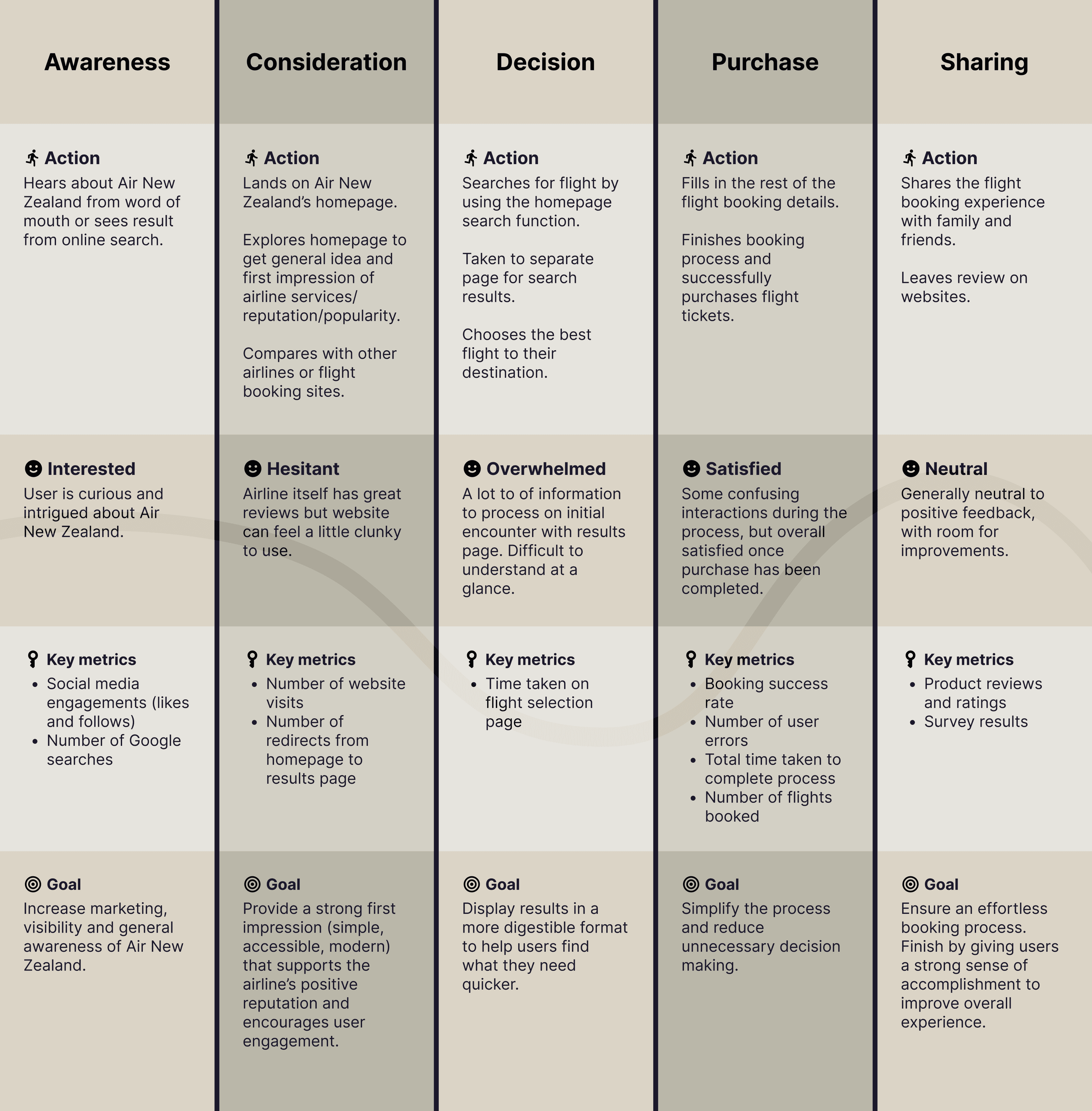
The flight booking stage (the search results page in particular) stood out among the process, as many users unanimously expressed frustration during this step. Thus the flight search page became one of the focal points of the redesign.
I also conducted further research to understand how other travel and airline websites approached the flight booking process and explored how these could be implemented on the current Air New Zealand website.


06: Design improvements
06: Design improvements
06: Design improvements
Each part of the design was carefully built with intention. My goal was to ensure these solutions not only met the original project goals, but also addressed the usability issues, accessibility issues and common pain points identified through user interviews. Some examples of these design improvements include:
Each part of the design was carefully built with intention. My goal was to ensure these solutions not only met the original project goals, but also addressed the usability issues, accessibility issues and common pain points identified through user interviews. Some examples of these design improvements include:
Each part of the design was carefully built with intention. My goal was to ensure these solutions not only met the original project goals, but also addressed the usability issues, accessibility issues and common pain points identified through user interviews. Some examples of these design improvements include:
1
1
1

USER PAIN POINT
USER PAIN POINT
Date/price comparison overpowered other elements
Date/price comparison overpowered other elements
This component would often distract users or result in confusion. Older users would also sometimes mistake these elements for actual flights.
This component would often distract users or result in confusion. Older users would also sometimes mistake these elements for actual flights.
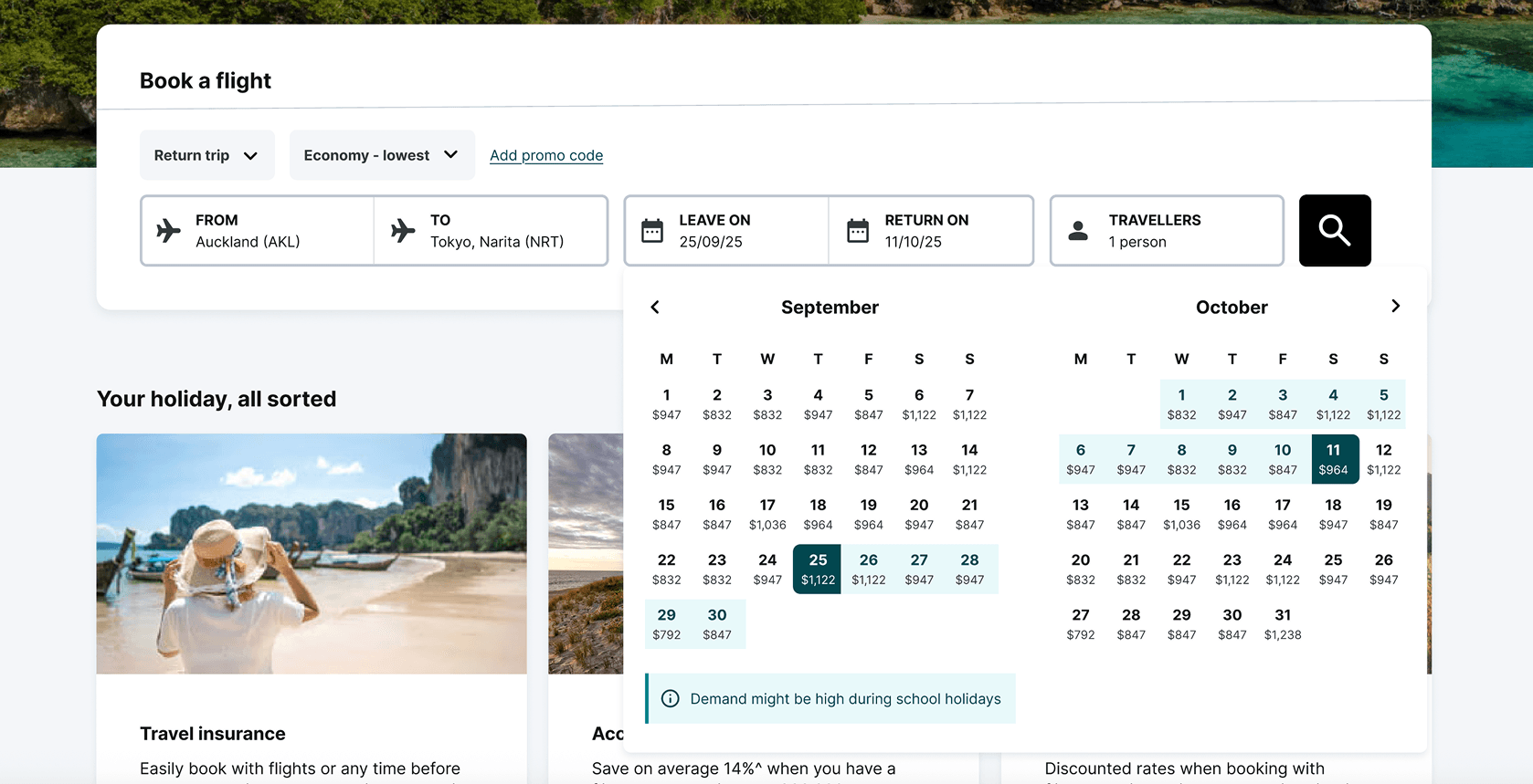
DESIGN IMPROVEMENT
DESIGN IMPROVEMENT
Introduced comparison earlier in the booking process
Introduced comparison earlier in the booking process
This comparison component was a useful feature, so rather than removing it, I moved it earlier in the booking process as part of the datepicker. This allows for larger scale comparisons, while also preventing it from overpowering other elements.
This comparison component was a useful feature, so rather than removing it, I moved it earlier in the booking process as part of the datepicker. This allows for larger scale comparisons, while also preventing it from overpowering other elements.
2
2
2
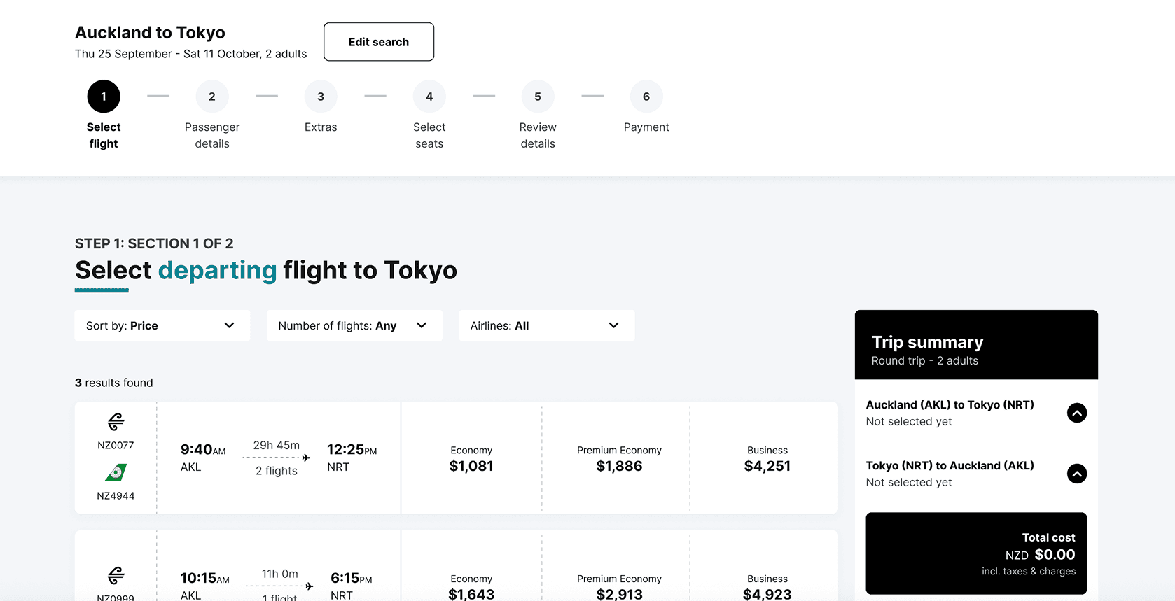
USER PAIN POINT
USER PAIN POINT
Selecting 2 individual flights for departure and return was unclear
Selecting 2 individual flights for departure and return was unclear
Users often assumed that the flight options included both departing and returning flights. Users only realised that this was not the case after scrolling down to select a second flight.
Users often assumed that the flight options included both departing and returning flights. Users only realised that this was not the case after scrolling down to select a second flight.
DESIGN IMPROVEMENT
DESIGN IMPROVEMENT
Emphasised individual selection of flights
Emphasised individual selection of flights
Through intentional visual styling and choice of wording, additional clarity has been provided around the flight selection process.
Through intentional visual styling and choice of wording, additional clarity has been provided around the flight selection process.
3
3
3
USER PAIN POINT
USER PAIN POINT
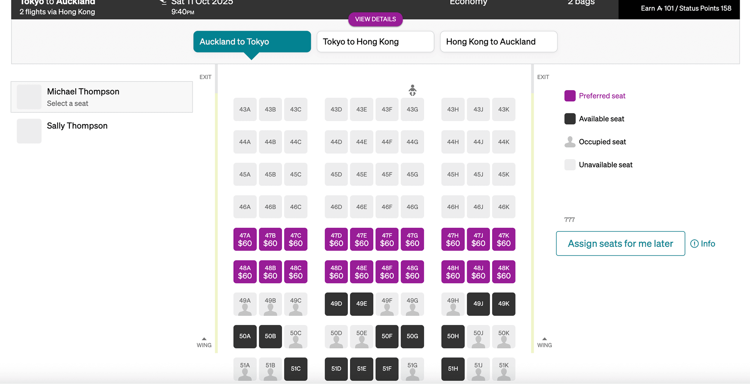
Available seats are unclear and inaccessible for colour-blind users
Available seats are unclear and inaccessible for colour-blind users
Many users initially tried to select a grey seat because it was unclear whether it was occupied or simply unselected. Colour alone is also used to differentiate seat types which may be inaccessible for colour-blind users.
Many users initially tried to select a grey seat because it was unclear whether it was occupied or simply unselected. Colour alone is also used to differentiate seat types which may be inaccessible for colour-blind users.
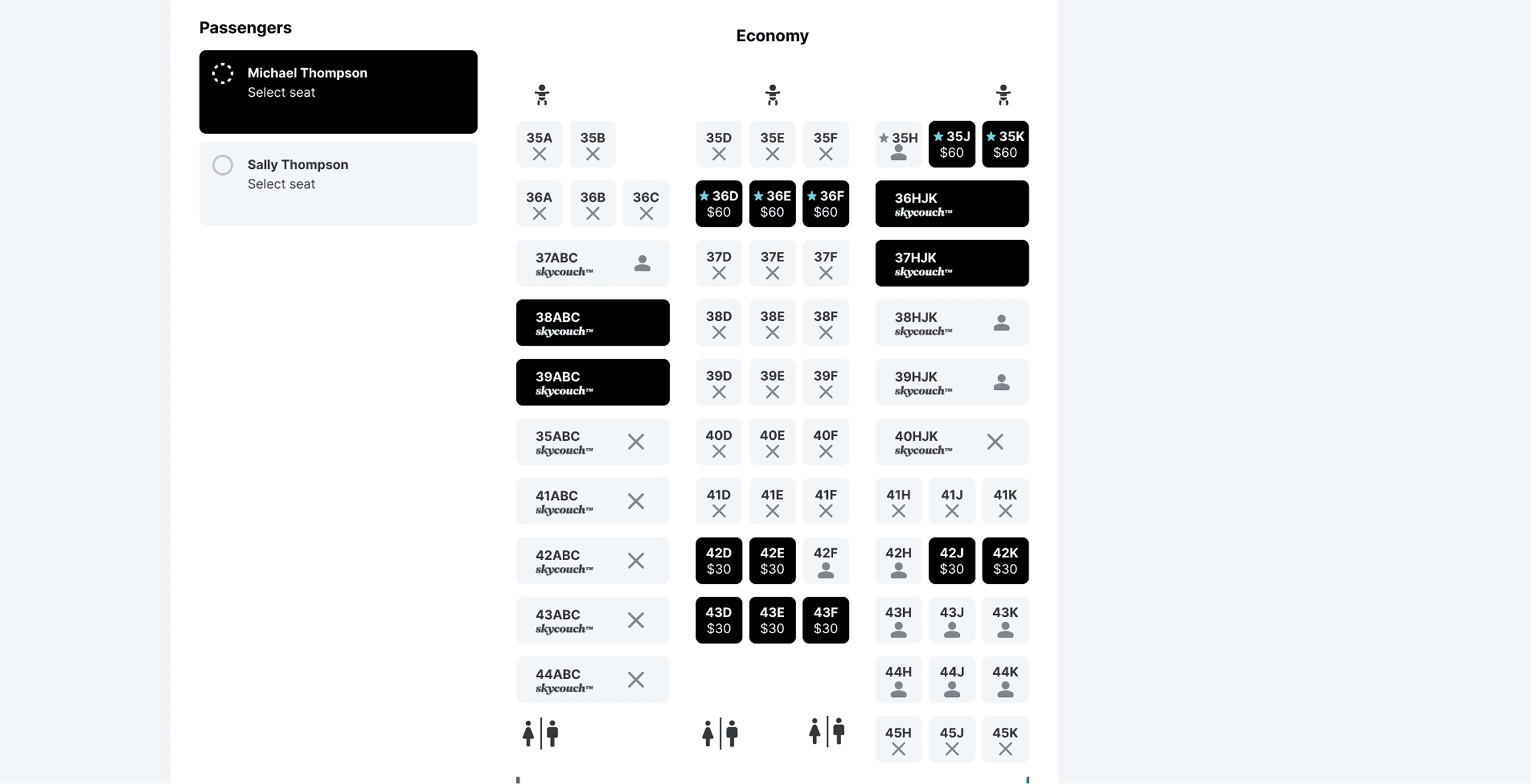
DESIGN IMPROVEMENT
DESIGN IMPROVEMENT
Simplified seat selection
Simplified seat selection
The main priority is for users to be able to instantly recognise available seats. Indicators for different seat types, such as exit row seats and preferred seats, is now conveyed via multiple cues and no longer depend solely on colour.
The main priority is for users to be able to instantly recognise available seats. Indicators for different seat types, such as exit row seats and preferred seats, is now conveyed via multiple cues and no longer depend solely on colour.
4
4
4
USER PAIN POINT
USER PAIN POINT
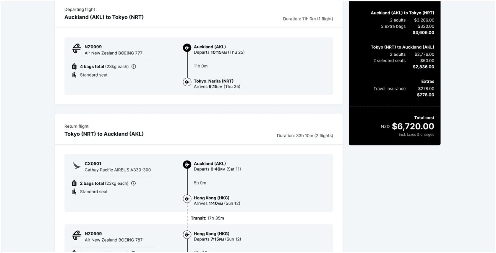
Details summary can be difficult to understand
Details summary can be difficult to understand
The information presented in the table can be initially confusing and overwhelming for users.
The information presented in the table can be initially confusing and overwhelming for users.
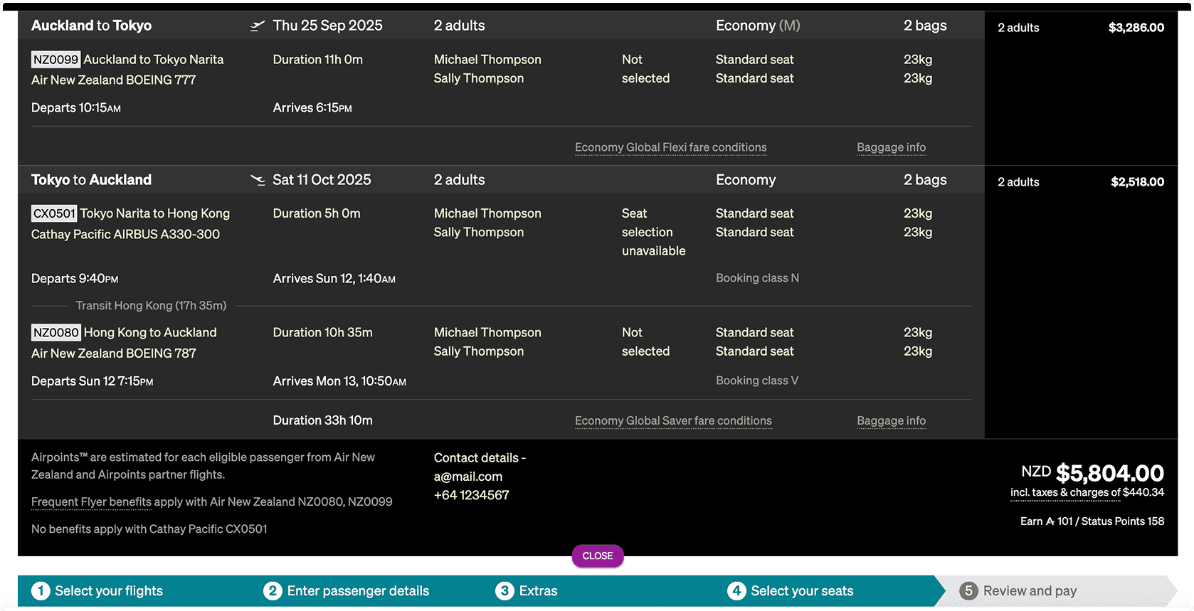
DESIGN IMPROVEMENT
DESIGN IMPROVEMENT
Details summary tells a story
Details summary tells a story
The details summary now presents information in a more digestible format by visually reflecting the user’s journey progression.
The details summary now presents information in a more digestible format by visually reflecting the user’s journey progression.
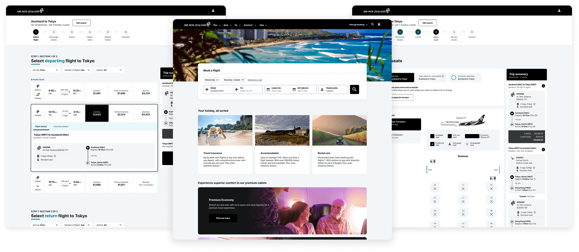
07: Final designs
07: Final designs
07: Final designs
Every page was constructed with a clear focus on usability and accessibility to ensure that customers feel acknowledged and supported. Increased customer engagement and satisfaction would not only support any business and financial goals that Air New Zealand might have, but also reinforces their promise and commitment to taking care of their people and their communities.
Every page was constructed with a clear focus on usability and accessibility to ensure that customers feel acknowledged and supported. Increased customer engagement and satisfaction would not only support any business and financial goals that Air New Zealand might have, but also reinforces their promise and commitment to taking care of their people and their communities.
Every page was constructed with a clear focus on usability and accessibility to ensure that customers feel acknowledged and supported. Increased customer engagement and satisfaction would not only support any business and financial goals that Air New Zealand might have, but also reinforces their promise and commitment to taking care of their people and their communities.
Homepage
Homepage
Homepage
Homepage
Flight selection page
Flight selection page
Flight selection page
Flight selection page
Extras page
Extras page
Extras page
Extras page
Seat selection page
Seat selection page
Seat selection page
Seat selection page
08: Key learnings
08: Key learnings
08: Key learnings
This project taught me a lot of valuable lessons about working with complex systems. I encountered several challenging problems during the process, but it was incredibly rewarding to work through them and find solutions that I am hopeful would make a positive impact on real users.
This project taught me a lot of valuable lessons about working with complex systems. I encountered several challenging problems during the process, but it was incredibly rewarding to work through them and find solutions that I am hopeful would make a positive impact on real users.
This project taught me a lot of valuable lessons about working with complex systems. I encountered several challenging problems during the process, but it was incredibly rewarding to work through them and find solutions that I am hopeful would make a positive impact on real users.
This project taught me a lot of valuable lessons about working with complex systems. I encountered several challenging problems during the process, but it was incredibly rewarding to work through them and find solutions that I am hopeful would make a positive impact on real users.
KEY LEARNING
KEY LEARNING
Work with complexity, not against it
Work with complexity, not against it
Work with complexity, not against it
In this project, I quickly realised that some websites will always require a certain level of complexity, which isn’t easy or feasible to simply just “remove”. I learnt how to work with that complexity instead of against it - focusing instead on what could be done to reduce confusion and provide clarity around these processes.
In this project, I quickly realised that some websites will always require a certain level of complexity, which isn’t easy or feasible to simply just “remove”. I learnt how to work with that complexity instead of against it - focusing instead on what could be done to reduce confusion and provide clarity around these processes.
In this project, I quickly realised that some websites will always require a certain level of complexity, which isn’t easy or feasible to simply just “remove”. I learnt how to work with that complexity instead of against it - focusing instead on what could be done to reduce confusion and provide clarity around these processes.
In this project, I quickly realised that some websites will always require a certain level of complexity, which isn’t easy or feasible to simply just “remove”. I learnt how to work with that complexity instead of against it - focusing instead on what could be done to reduce confusion and provide clarity around these processes.
KEY LEARNING
KEY LEARNING
Balancing between existing branding and new changes
Balancing between existing branding and new changes
Balancing between existing branding and new changes
Since Air New Zealand is a well-established company, I needed to find the right balance between ensuring that the redesign didn’t deviate too strongly away from the original branding, while still providing changes that brought value and improvements to the current user experience. This project taught me that it was important to retain effective functionality and focus on identifying and improving areas that needed refinement.
Since Air New Zealand is a well-established company, I needed to find the right balance between ensuring that the redesign didn’t deviate too strongly away from the original branding, while still providing changes that brought value and improvements to the current user experience. This project taught me that it was important to retain effective functionality and focus on identifying and improving areas that needed refinement.
Since Air New Zealand is a well-established company, I needed to find the right balance between ensuring that the redesign didn’t deviate too strongly away from the original branding, while still providing changes that brought value and improvements to the current user experience. This project taught me that it was important to retain effective functionality and focus on identifying and improving areas that needed refinement.
Since Air New Zealand is a well-established company, I needed to find the right balance between ensuring that the redesign didn’t deviate too strongly away from the original branding, while still providing changes that brought value and improvements to the current user experience. This project taught me that it was important to retain effective functionality and focus on identifying and improving areas that needed refinement.
KEY LEARNING
KEY LEARNING
Real-world constraints
Real-world constraints
Real-world constraints
I had the liberty of redesigning this process without needing to account for any technical, time or resource limitations. In a real-world scenario, I recognise that such constraints exist, and feel confident that, with my experience as a developer and soft skills I’ve developed in my career, I am able to work within these boundaries and navigate these challenges efficiently.
I had the liberty of redesigning this process without needing to account for any technical, time or resource limitations. In a real-world scenario, I recognise that such constraints exist, and feel confident that, with my experience as a developer and soft skills I’ve developed in my career, I am able to work within these boundaries and navigate these challenges efficiently.
I had the liberty of redesigning this process without needing to account for any technical, time or resource limitations. In a real-world scenario, I recognise that such constraints exist, and feel confident that, with my experience as a developer and soft skills I’ve developed in my career, I am able to work within these boundaries and navigate these challenges efficiently.
I had the liberty of redesigning this process without needing to account for any technical, time or resource limitations. In a real-world scenario, I recognise that such constraints exist, and feel confident that, with my experience as a developer and soft skills I’ve developed in my career, I am able to work within these boundaries and navigate these challenges efficiently.
Thanks for visiting!
© 2025 Ella Banaticla
Let's get in touch
Thanks for visiting!
© 2025 Ella Banaticla
Let's get in touch