PASSION PROJECT | MARCH 2025
PASSION PROJECT |
MARCH 2025

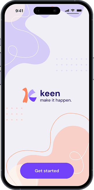
Keen
Designing digital tools to help bring people together
Designing digital tools to help bring people together
Designing digital tools to help bring people together
Designing digital tools to help bring people together
Designing digital tools to help bring people together
An app concept driven by a real challenge I often face as a young 20-something year old. The aim of the app is to remove the stress of planning hangouts for adults and rekindle the excitement of getting together with friends.
An app concept driven by a real challenge I often face as a young 20-something year old. The aim of the app is to remove the stress of planning hangouts for adults and rekindle the excitement of getting together with friends.
An app concept driven by a real challenge I often face as a young 20-something year old. The aim of the app is to remove the stress of planning hangouts for adults and rekindle the excitement of getting together with friends.
01: Project background
01: Project background
01: Project background
As a young adult, I’ve noticed that conversations with my friends have been frequently circling back to the same topic, “I miss the days when it was so easy to hang out with friends.”
In university, hanging out with friends was simple and often didn't require extensive planning beforehand. This changed significantly as an adult now working full-time and thus lead me to the question:
How could I make hanging out feel “fun” and “spontaneous” again?
02: The problem
02: The problem
02: The problem
Planning meetups with friends can be stressful.
Planning meetups with friends can be stressful.
Planning meetups with friends can be stressful.
I conducted a small survey with 10 young adults (all in their early to mid 20s) to better understand and pinpoint the kind of issues people might be struggling with when it comes to planning meetups with friends.
There were the most commonly brought up points.
I conducted a small survey with 10 young adults (all in their early to mid 20s) to better understand and pinpoint the kind of issues people might be struggling with when it comes to planning meetups with friends.
There were the most commonly brought up points.
I conducted a small survey with 10 young adults (all in their early to mid 20s) to better understand and pinpoint the kind of issues people might be struggling with when it comes to planning meetups with friends.
There were the most commonly brought up points.
I conducted a small survey with 10 young adults (all in their early to mid 20s) to better understand and pinpoint the kind of issues people might be struggling with when it comes to planning meetups with friends.
There were the most commonly brought up points.
I conducted a small survey with 10 young adults (all in their early to mid 20s) to better understand and pinpoint the kind of issues people might be struggling with when it comes to planning meetups with friends.
There were the most commonly brought up points.
What challenges do you face when planning social hangouts with friends?
USER RESPONSE
USER RESPONSE
"Everyone is always so busy"
"Everyone is always so busy"
"Everyone is always so busy"
"Everyone is always so busy"
It can often be hard to find a date/time that works, which leads to a lot of back and forth when trying to sort out a plan.
It can often be hard to find a date/time that works, which leads to a lot of back and forth when trying to sort out a plan.
It can often be hard to find a date/time that works, which leads to a lot of back and forth when trying to sort out a plan.
It can often be hard to find a date/time that works, which leads to a lot of back and forth when trying to sort out a plan.
USER RESPONSE
USER RESPONSE
"I don’t like hosting"
"I don’t like hosting"
"I don’t like hosting"
"I don’t like hosting"
Hosting can take a lot of effort, be time-consuming and discouraging if people don’t engage.
Hosting can take a lot of effort, be time-consuming and discouraging if people don’t engage.
Hosting can take a lot of effort, be time-consuming and discouraging if people don’t engage.
Hosting can take a lot of effort, be time-consuming and discouraging if people don’t engage.
USER RESPONSE
USER RESPONSE
"People forget about other obligations"
"People forget about other obligations"
"People forget about other obligations"
"People forget about other obligations"
Last minute changes can be stressful for everyone involved.
Last minute changes can be stressful for everyone involved.
Last minute changes can be stressful for everyone involved.
Last minute changes can be stressful for everyone involved.
03: Research
03: Research
03: Research
To gain a clearer idea of what I was designing for, I conducted research on general app usage and event-related data. Admittedly, it was difficult to find data directly related to the problem I was trying to solve, so I looked for other relevant information to help inform me of the right approach to this problem.
I also wanted to ensure that there was something that differentiated this product from other currently existing event apps, so I conducted some research into these apps to identify what kind of things I wanted to approach differently.
Event apps have grown in usage by 23%
Event apps have grown in usage by 23%
Event apps have grown in usage by 23%
Apps have helped organisers to facilitate events through the use of features such as networking, scheduling and in-app notifications.
Apps have helped organisers to facilitate events through the use of features such as networking, scheduling and in-app notifications.
Apps have helped organisers to facilitate events through the use of features such as networking, scheduling and in-app notifications.
Apps have helped organisers to facilitate events through the use of features such as networking, scheduling and in-app notifications.
Users (aged 16 to 64) on average spend 2h 20m on social media.
Users (aged 16 to 64) on average spend 2h 20m on social media.
Users (aged 16 to 64) on average spend 2h 20m on social media.
In addition, younger audiences (16 - 24 years old) are slightly more likely to prefer social network apps over chat and messaging apps.
In addition, younger audiences (16 - 24 years old) are slightly more likely to prefer social network apps over chat and messaging apps.
In addition, younger audiences (16 - 24 years old) are slightly more likely to prefer social network apps over chat and messaging apps.
In addition, younger audiences (16 - 24 years old) are slightly more likely to prefer social network apps over chat and messaging apps.
Other event apps may already exist, but they are...
Other event apps may already exist, but they are...
Other event apps may already exist, but they are...
no longer primarily used by a younger audience
focused on community/public events
or have too many additional features that detract from the main purpose of the app
no longer primarily used by a younger audience
focused on community/public events
or have too many additional features that detract from the main purpose of the app
no longer primarily used by a younger audience
focused on community/public events
or have too many additional features that detract from the main purpose of the app
no longer primarily used by a younger audience
focused on community/public events
or have too many additional features that detract from the main purpose of the app
The data I was able to collect from my research guided my decisions about the solution I was designing. I wanted to create a product that catered to a younger audience, and my research helped me to understand that it may be preferable to create a social network app rather than a messaging app. There was also inspiration to be taken from other existing event apps that make use of scheduling and notifications to organise events.
The data I was able to collect from my research guided my decisions about the solution I was designing. I wanted to create a product that catered to a younger audience, and my research helped me to understand that it may be preferable to create a social network app rather than a messaging app. There was also inspiration to be taken from other existing event apps that make use of scheduling and notifications to organise events.
The data I was able to collect from my research guided my decisions about the solution I was designing. I wanted to create a product that catered to a younger audience, and my research helped me to understand that it may be preferable to create a social network app rather than a messaging app. There was also inspiration to be taken from other existing event apps that make use of scheduling and notifications to organise events.
The data I was able to collect from my research guided my decisions about the solution I was designing. I wanted to create a product that catered to a younger audience, and my research helped me to understand that it may be preferable to create a social network app rather than a messaging app. There was also inspiration to be taken from other existing event apps that make use of scheduling and notifications to organise events.
The data I was able to collect from my research guided my decisions about the solution I was designing. I wanted to create a product that catered to a younger audience, and my research helped me to understand that it may be preferable to create a social network app rather than a messaging app. There was also inspiration to be taken from other existing event apps that make use of scheduling and notifications to organise events.
04: Product goals
04: Product goals
04: Product goals
Based on the user responses I received in the survey and the information I was able to gather through research, I identified three main goals for this product. The aim of these product goals is to resolve the common challenges people are currently facing.
Based on the user responses I received in the survey and the information I was able to gather through research, I identified three main goals for this product. The aim of these product goals is to resolve the common challenges people are currently facing.
Based on the user responses I received in the survey and the information I was able to gather through research, I identified three main goals for this product. The aim of these product goals is to resolve the common challenges people are currently facing.
Based on the user responses I received in the survey and the information I was able to gather through research, I identified three main goals for this product. The aim of these product goals is to resolve the common challenges people are currently facing.
PRODUCT GOAL
PRODUCT GOAL
Provide an engaging and effortless way to set up hangouts and events.
Provide an engaging and effortless way to set up hangouts and events.
Provide an engaging and effortless way to set up hangouts and events.
PRODUCT GOAL
PRODUCT GOAL
Help users stay on top of existing social plans.
Help users stay on top of existing social plans.
Help users stay on top of existing social plans.
PRODUCT GOAL
PRODUCT GOAL
Create opportunities for spontaneous and casual meetups.
Create opportunities for spontaneous and casual meetups.
Create opportunities for spontaneous and casual meetups.
05: Initial designs
05: Initial designs
05: Initial designs
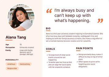
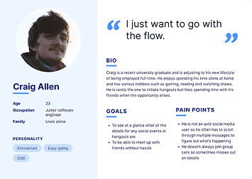
I first wanted to gain a deeper understanding of my target audience. This meant considering what kind of goals these users would have, their limitations and pain points, in what ways they would engage with the app and how they would benefit from it.
I developed three core user profiles to guide my design decisions and ensure that they aligned with my users’ needs and goals.
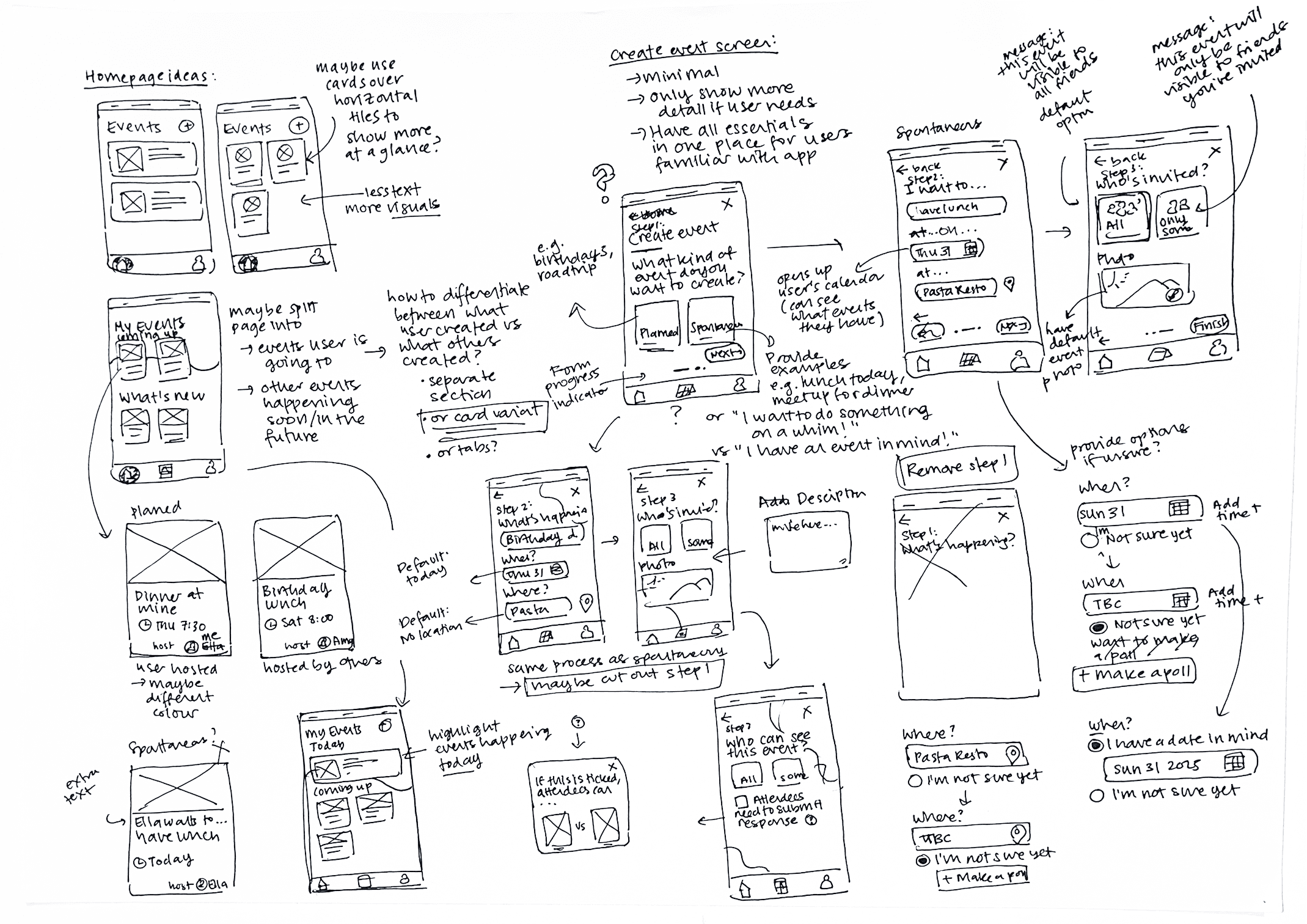
After obtaining a better understanding of who I was designing for, I began brainstorming and iterating through various designs. My main priority was to ensure that the overall flow of the process and each of its stages was intuitive and effortless.
After obtaining a better understanding of who I was designing for, I began brainstorming and iterating through various designs. My main priority was to ensure that the overall flow of the process and each of its stages was intuitive and effortless.
After obtaining a better understanding of who I was designing for, I began brainstorming and iterating through various designs. My main priority was to ensure that the overall flow of the process and each of its stages was intuitive and effortless.
06: Design improvements
06: Design improvements
06: Design improvements
After building an interactive prototype of my initial designs, I asked a small number of users to perform specific tasks (e.g. “Can you create an event for me with [xyz] details?”) and observed how they approached the process.
Overall, users were able to successfully complete the tasks without much difficulty or error. For areas that did result in some confusion or hesitation, I implemented improvements based on observations and user feedback. A couple of examples of these improvements can be found below:
1
1
1
USER FEEDBACK
Difficult to see information at a glance
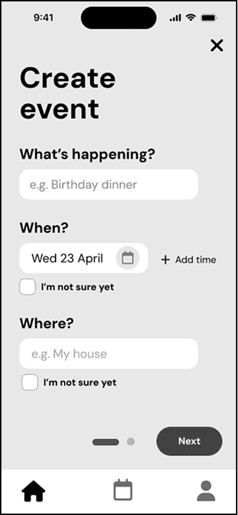
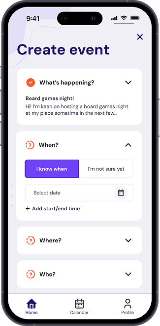
Initially, I split the form across multiple pages to reduce cognitive load and avoid overwhelming users. However, some users offered feedback that having a quick and easy way to review all the details at once was useful.
USER FEEDBACK
Slower event editing process
The multi-page form greatly slowed down the event editing process, as it required scrolling through multiple screens. This was especially tedious when only a single section required changes.
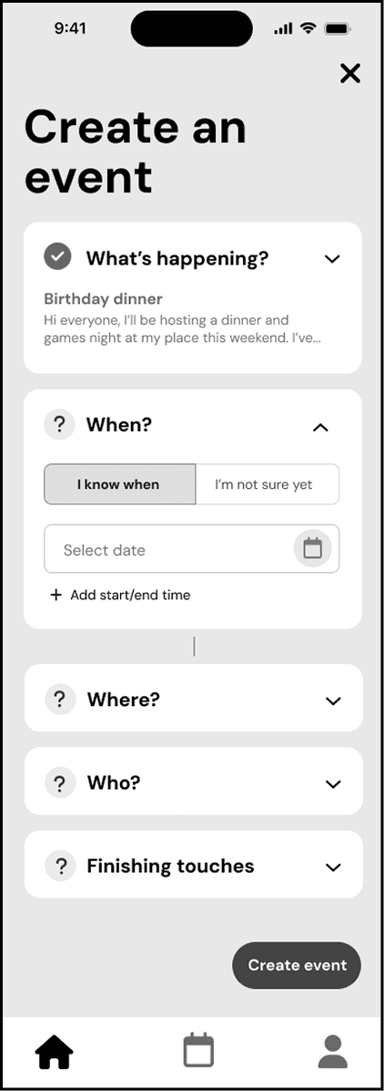
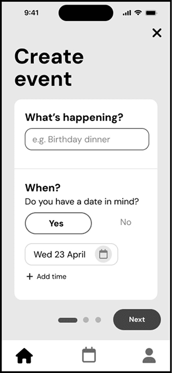
DESIGN IMPROVEMENT
Collapsible accordions
By converting each section into an accordion instead, users are able to view only what they need, while also having all content on a single screen for convenience.
DESIGN IMPROVEMENT
Progress indicators
Each accordion now includes a check or question mark icon. This provides users with a quick indication about their progress.
DESIGN IMPROVEMENT
Peekaboo content
Collapsed accordions display a summary of entered information to allow users to review their submitted details at a glance.
USER FEEDBACK
Difficult to see information at a glance
Initially, I split the form across multiple pages to reduce cognitive load and avoid overwhelming users. However, some users offered feedback that having a quick and easy way to review all the details at once was useful.
USER FEEDBACK
Slower event editing process
The multi-page form greatly slowed down the event editing process, as it required scrolling through multiple screens. This was especially tedious when only a single section required changes.
DESIGN IMPROVEMENT
Collapsible accordions
By converting each section into an accordion instead, users are able to view only what they need, while also having all content on a single screen for convenience.
DESIGN IMPROVEMENT
Progress indicators
Each accordion now includes a check or question mark icon, providing users with a quick indication about their progress.
DESIGN IMPROVEMENT
Peekaboo content
Collapsed accordions display a summary of entered information to allow users to review their submitted details at a glance.
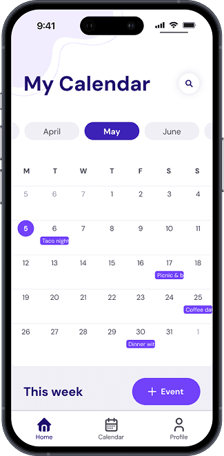
2
2
USER FEEDBACK
Excessive clicking to check upcoming events
I initially opted for a compact calendar to keep the interface clean and simple. However, I noticed that users were clicking several times to view events for each date. This might not be a big problem during quiet months, but it could quickly become time consuming for busier periods.
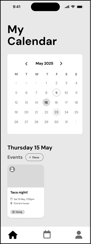
DESIGN IMPROVEMENT
Expanded calendar view
I updated the calendar display so that it now openly previews the events for each date. These previews would be more helpful for busy users who may have multiple events in a day.
DESIGN IMPROVEMENT
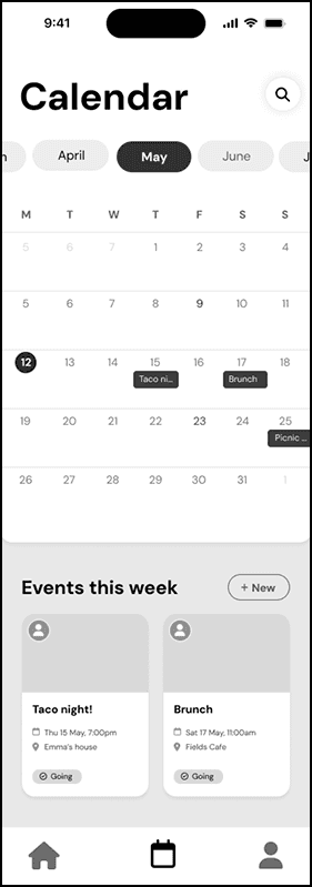
“Events this week” section
The “Events this week” section is an additional way to allow users to quickly view immediate, upcoming events in more detail.
2
USER FEEDBACK
Excessive clicking to check upcoming events
I initially opted for a compact calendar to keep the interface clean and simple. However, I noticed that users were clicking several times to view events for each date. This might not have been a big problem during quiet months, but it could quickly become time consuming for busier periods.
DESIGN IMPROVEMENT
Expanded calendar view
I updated the calendar display so that it now openly previews the events for each date. These previews would be more helpful for busy users who may have multiple events in a day.
DESIGN IMPROVEMENT
“Events this week” section
The “Events this week” section is an additional way to allow users to quickly view immediate, upcoming events in more detail.
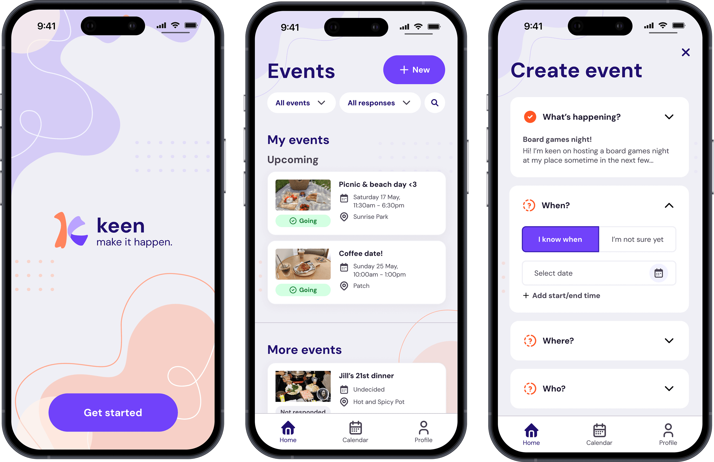
07: Final designs
07: Final designs
07: Final designs
After revising and making improvements to my initial designs, I developed the branding, visual assets and logo for the app. This all came together at the end to create the final designs.
My goal was to evoke a sense of modern fun and playfulness to align with my target audience and product goals. I carefully considered the colours, visual tone and overall feel to create something that felt intimate and personal; I wanted users to feel like they were connecting with close friends. At the same time, I also wanted to ensure that the experience remained intuitive and familiar by following established, standard practices.

After completing the designs, I considered how I would assess the app's performance if this were a commercial product in the real world. These would be some example metrics that I would track to evaluate how effectively it met the initial goals.
After completing the designs, I considered how I would assess the app's performance if this were a commercial product in the real world. These would be some example metrics that I would track to evaluate how effectively it met the initial goals.
After completing the designs, I considered how I would assess the app's performance if this were a commercial product in the real world. These would be some example metrics that I would track to evaluate how effectively it met the initial goals.
After completing the designs, I considered how I would assess the app's performance if this were a commercial product in the real world. These would be some example metrics that I would track to evaluate how effectively it met the initial goals.
PRODUCT GOAL
PRODUCT GOAL
Provide an engaging and effortless way to set up hangouts and events.
Provide an engaging and effortless way to set up hangouts and events.
Provide an engaging and effortless way to set up hangouts and events.
MEASURED BY
MEASURED BY
How much time do users spend, on average, creating an event?
How many errors, on average, do users encounter when creating an event?
How much time do users spend, on average, creating an event?
How many errors, on average, do users encounter when creating an event?
How much time do users spend, on average, creating an event?
How many errors, on average, do users encounter when creating an event?
PRODUCT GOAL
PRODUCT GOAL
Help users stay on top of existing social plans.
Help users stay on top of existing social plans.
Help users stay on top of existing social plans.
MEASURED BY
MEASURED BY
How often do users view (click) on the calendar section?
How often do users use the sort filters on the home screen?
How often do users view (click) on the calendar section?
How often do users use the sort filters on the home screen?
How often do users view (click) on the calendar section?
How often do users use the sort filters on the home screen?
PRODUCT GOAL
PRODUCT GOAL
Create opportunities for spontaneous and casual meetups.
Create opportunities for spontaneous and casual meetups.
Create opportunities for spontaneous and casual meetups.
MEASURED BY
MEASURED BY
What percentage of events are initially created with unknown details (e.g. date, location, attendees)?
Of these events, how many users utilise and engage in polls?
What percentage of events are initially created with unknown details (e.g. date, location, attendees)?
Of these events, how many users utilise and engage in polls?
What percentage of events are initially created with unknown details (e.g. date, location, attendees)?
Of these events, how many users utilise and engage in polls?
08: Key learnings
08: Key learnings
08: Key learnings
As my first UX project, I thoroughly enjoyed working on Keen. Creating the product concept from scratch taught me a lot of valuable lessons that I will continue to carry on to my future work.
As my first UX project, I thoroughly enjoyed working on Keen. Creating the product concept from scratch taught me a lot of valuable lessons that I will continue to carry on to my future work.
As my first UX project, I thoroughly enjoyed working on Keen. Creating the product concept from scratch taught me a lot of valuable lessons that I will continue to carry on to my future work.
As my first UX project, I thoroughly enjoyed working on Keen. Creating the product concept from scratch taught me a lot of valuable lessons that I will continue to carry on to my future work.
KEY LEARNING
KEY LEARNING
Focus on features first, not details
Focus on features first, not details
Focus on features first, not details
Looking back, I focused too heavily on perfecting the flow and details in the early stages. While my intention was to ensure a clear and efficient structure, I found that over-designing in the beginning made it difficult for me to let go and deviate from initial ideas later on.
Looking back, I focused too heavily on perfecting the flow and details in the early stages. While my intention was to ensure a clear and efficient structure, I found that over-designing in the beginning made it difficult for me to let go and deviate from initial ideas later on.
Looking back, I focused too heavily on perfecting the flow and details in the early stages. While my intention was to ensure a clear and efficient structure, I found that over-designing in the beginning made it difficult for me to let go and deviate from initial ideas later on.
Looking back, I focused too heavily on perfecting the flow and details in the early stages. While my intention was to ensure a clear and efficient structure, I found that over-designing in the beginning made it difficult for me to let go and deviate from initial ideas later on.
KEY LEARNING
KEY LEARNING
More observing, less speaking
More observing, less speaking
More observing, less speaking
When users were interacting with my prototype, I noticed that they often did not know (or want to say) which areas needed improvement when asked directly. I found that it was much more valuable to quietly observe their behaviour, and then follow up with specific questions about their particular actions afterwards.
When users were interacting with my prototype, I noticed that they often did not know (or want to say) which areas needed improvement when asked directly. I found that it was much more valuable to quietly observe their behaviour, and then follow up with specific questions about their particular actions afterwards.
When users were interacting with my prototype, I noticed that they often did not know (or want to say) which areas needed improvement when asked directly. I found that it was much more valuable to quietly observe their behaviour, and then follow up with specific questions about their particular actions afterwards.
When users were interacting with my prototype, I noticed that they often did not know (or want to say) which areas needed improvement when asked directly. I found that it was much more valuable to quietly observe their behaviour, and then follow up with specific questions about their particular actions afterwards.
KEY LEARNING
KEY LEARNING
Gather user feedback regularly
Gather user feedback regularly
Gather user feedback regularly
I occasionally found myself in situations where making a design improvement resolved one issue, but unintentionally introduced another one elsewhere. I think it would have been good to have gone through an additional round of user testing at the end to help to reveal any “blind spots” that I may have overlooked and ensure that my designs were robust.
I occasionally found myself in situations where making a design improvement resolved one issue, but unintentionally introduced another one elsewhere. I think it would have been good to have gone through an additional round of user testing at the end to help to reveal any “blind spots” that I may have overlooked and ensure that my designs were robust.
I occasionally found myself in situations where making a design improvement resolved one issue, but unintentionally introduced another one elsewhere. I think it would have been good to have gone through an additional round of user testing at the end to help to reveal any “blind spots” that I may have overlooked and ensure that my designs were robust.
I occasionally found myself in situations where making a design improvement resolved one issue, but unintentionally introduced another one elsewhere. I think it would have been good to have gone through an additional round of user testing at the end to help to reveal any “blind spots” that I may have overlooked and ensure that my designs were robust.
Thanks for visiting!
© 2025 Ella Banaticla
Let's get in touch
Thanks for visiting!
© 2025 Ella Banaticla
Let's get in touch